Wednesday, December 4, 2013

Fashionista, Ancient and Modern

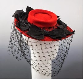
Everyone wants to keep up with the trends of their time. The clothes we wear not only make us look good but they represent the time period in which we are living and who we are as a person. My exhibit, “Fashionista” covers fashion trends from ancient Egypt to modern day, consisting of dresses, shoes, hats and scarfs. Since we use the expression from outfitted ourselves from “head to toe”, I chose to display my objects from the hats people wore to the shoes they walked in.  One work displayed in my exhibit, “Titleholder’s Hat”, played a huge role for men in the Kuba Kingdom as a formal admission to adulthood. A male who received this cap was accepted into adulthood and was ready to take responsibility in the Kingdom. In the 19th century, there existed a trend amongst chinese women to wrap their feet around or wear lotus shoes so they can have tiny feet. This trend demonstrates the great influence of fashion on women due to their willful subjection to pain in order to fit in. The oldest object in my exhibit is the “Belt Buckle”, created during the Frankish Empire in the 6th century. Although this work is significantly dated, it possesses a certain familiarity to us because we have belt buckles like these nowadays. Working on this project I came to a conclusion that every time period has a different type of trend, which effects people greatly. All these fashion trends inspired cultures to create their own ideas.


Kuban
“Titleholder’s Hat (Laket mishiing)”
19th-20th century
Arts of Africa, Oceania and the Americas
Bergdorf Goodman
“Hat”
1944
Costume Institute

Sally Victor
“Hat”
1945
Costume Institute


French
“Scarf”
1790-1810
Costume Institute


Ulrich Apt the Elder
“Portrait of a Man and His Wife”
1512
European Paintings


French Painter
“Henri III, King of France”
16th century 
European Paintings

probably Mexican
“Toreador Suit”
fourth quarter 19th century
Costume Institute

Domenico Dolce & Stefano Gabbana
“Dress”
2007
Costume Institute
11.


  1. Frankish Empire
“Belt Buckle”
675-725
Medieval Art


Chinese (Han Dynasty)
“Lotus Shoes”
late 19th-20 century
Costume Institute


Tuesday, November 5, 2013

"Magritte: The Mystery of the Ordinary"

(Extra credit 1)

"La condition humaine", is a 39 in x 32 oil on canvas painting by René Magritte in 1933. This painting shows a view of a canvas standing in front of a window. Outside the window you see a landscape and part of that landscape is depicted on the canvas. I believe that Magritte uses a technique to have the viewer question their reality. Meaning a painting of nature isn't always as accurate as it is in nature. No matter what you do as a painter, depicting the natural world is nearly impossible to paint because there's just so much to capture. Another point that Magritte tries to show his viewer is that whatever is depicted on the canvas might not exactly be behind it. An artist can add anything he wishes to add or replace anything with another. For example that tree on the canvas, is it really there? The artist creates an illusion by putting a tree on the canvas which makes us wonder. In human nature, what we tend to see is what we BELIEVE is correct, but is it? Magritte uses this technique in numerous of his paintings. The painting below "Euclidean Promenades" painted in 1955 is similar to "La condition humaine". Your eyes also tend to see the obvious but it may just be a misleading illusion.

Tuesday, October 15, 2013

Project 3


      "Illustrate a Story"


         In this story, Dawn Burke talks to her husband about keeping rats as pets in their house.  She was always disgusted of rats but when she saw her neighbors pet rat she started to like it. Eventually, she bought her own pet rat and named it Trizilla. Soon enough Dawn and her husband bought more pet rats and before they knew it, they had seventy two. They were the first rat sanctuary in the United States to have 501 C3 status. Someone said that the rats in their house have so much space and freedom that its like a "Taj Mahal" for rats. My illustration shows Mr. and Mrs. Burke's  living room. It has plenty of space and open cages on tables the way Mrs. Burke explained it. It's like a paradise for rats. This out of the ordinary couple has rats as pets because they want to show others that they are worth more then snake bate. They want to show people that rats have hearts and its wrong to mistreat them. They also show people that rats can become house pets. Dawn Burke talks about Anne, her heart rat and she explains how smart she is and how she greets guests at the door.  In my illustration the rat in the center looking at you depicts Anne, greeting the viewer into their house.

   
                                                              Rat Paradise


Wednesday, October 9, 2013

Field Trip 5


Chelsea Galleries

Last week I visited the galleries in Chelsea. I had a very great time and a good ecercise walking from gallery to gallery looking at all types of unique art work.    I found Jim Kempner Fine Art Gallery on  501 W 23rd St, very interesting.  However, the artwork in Anton Kearn Gallery on 532 West 20th St,didn’t really impress me.                                                                                                                                                                                                                                                                                                                                                                                         


I would like to buy and display these sculptures above in my room because they depict my favorite sport, which is swimming. "Miniature Quan", the two sculptures kneeling on the ball is 11 x 11 x 7.1 in, perfect size to place on a desk. This sculpture exemplifies the importance of the balance of a swimmer,proportion and her body language. They come in different colors so you can choose the one that stands out to you the most. "Bling Miniature Serena", the one  is another work done by Feuerman, and it is also a sculpture of a girl swimmer. However, this one focuses more on the swimmers face. This sculpture is different then others because the cap that the swimmer is wearing has Swarovski crystals. It is 9.5 x 17 x 7.5 in, also a good size to place on a desk. Her works almost seem real when you see it in person. They look like they are ready to swim away. All of the details on the sculpture, like the water droplets, she hand paints. "Miniature Quan" is $14,800 and "Bling Miniature Serena" is $38,000. Even though these works are pretty expensive, when I become rich I would definitely consider buying atleast one of them.  It would be nice to pass by these works daily because they will remind me of the time I use to compete in swimming competitions. This would influence my daily life because it will cause me to be confident and strong. I wouldn’t be afraid to invest in one of these works because swimming is a sport that will never get boring or forgotten. Therefore I believe this work will always stay popular.


“Meat” by Wilhelm Sasnal is one work of art that I wouldn’t buy. This is a 63 1/8 x 86 3/4 inch oil on canvas painting. I would never consider buying this work because I wouldn’t like to look at a piece of meat hanging in my apartment. Passing this painting daily would be tremendous because it would make my stomach growl, especially in the morning. This painting doesn’t interest me and I see no meaning behind it. Another work by the same artist that I wouldn’t buy is “Untitled”. “Untitled is a 63x63 ich, oil on canvas painting. This painting is very plain and contains only two colors, black and white. I wouldn’t like if this dull painting was hanging on my wall because it frightens me a bit. In the painting there is a person with no face, just ears and chin. I wouldn’t invest in these two paintings because to me there is no meaning behind it.


It all depends on your personal preference what you like and don’t like. If I don’t understand the artwork or it doesn’t give me a feeling of aesthetic emotion, then I don’t plan on investing in it.


Field Trip 1


Our first trip introduced us to the world of modern Art. Each work of art at MoMa, had some sort of story behind it. All artists express a unique form of identity through their artwork. Identity plays a big role in art because it identifies the artist’s personal, historical and cultural background. Roaming around the museum I found three works that had an interesting identity.


The first piece of artwork that caught my eye was “The Three Musicians” by Fernand Léger. This painting reflects the authors cultural identity. It is an oil on canvas painting created in 1944. The first thing I looked at when I saw this painting were the three men playing instruments. The three men in the painting are Pauvre Picasso, Pauvre Braque and Léger himself. The setting of the painting takes place in Paris. They all are dressed elegant and look very professional. Leger used his personal form of cubism to create this piece. The reason I chose this picture as cultural identity is because it made me feel like im in a fancy restaurant, eating a delicious meal, and listening to romantic music in Paris. 


G.Schleicher’s and Konstanty Gutschow’s “Bank and Office Building” has a historical identity. It is a silver-gelatin photograph that was taken in Germany,1928. This picture automatically took me to the past and I felt like I was living in the old days because of all the detail it has. In the photograph you can see the brick floor and the train tracks on it.  There are people in the backround all just roaming around the busy city. It is a non-colorful photograph because back then they didn’t have the technology we have today. The reason I would consider this piece as a historical indentity is because nowadays we live a totally different lifestyle then people back then. Everything looks completely different. The car on the left side of the photo is the first luxury Ford invented. Almost in the center there’s an announcement booth which 


Visiting MoMa was a great experience because it allowed me to view art differently.  I learned to appreciate and understand the work by viewing it through the artist’s eye.  The story’s behind the paintings makes it easier for you to identify their identity. There’s more behind art then it’s beauty if you actually take the time to perceive it!

Tuesday, September 24, 2013

Narrative Digital Collage


There comes a time in every teenagers life when their minds tend to travel into space. All they think about is going out to parties and meeting new people. This collage shows the time in my life when i went through this phase.

Wednesday, September 18, 2013

Good Art & Bad Art


Good Art

In my opinion good art to a viewer is considered good art depending how the viewer interprets the artwork. To me this piece of art is good because it shows lots of emotions and expressions. It has many vivid colors which bring a positive vibe to me as well as others. The way this artist painted this picture, with different color brush strokes you can tell he put time and effort into it. Many people may have different opinions about this painting but the way i interpret it is i see a women playing a cello and she looks very focused and concentrated. To me the colorful background shows that the musician is in her own little world and doesn't think about anything around her.


Bad Art

In my opinion bad art is something that doesn’t convey enough expressions and is just too simple.It's basically art that doesnt require you to use your imagination to find out the message the artist is trying to put out there. To me bad art is art that is boring and plain.              


The piece of art below is bad art because even though it shows emotions and grasps peoples attention, it vandalizes peoples property. Instead of destroying peoples property, artists should put their artwork on paper.